Bitly is the default URL shortener for most marketers, and for basic link shortening, it works fine. But the moment you need analytics beyond click counts and city-level geography, you hit a wall — and that wall costs $35 to $300 per month to climb. If you’ve been paying for Bitly and wondering whether the analytics justify the price, or you’re on the free plan and want more without the enterprise price tag, here are the best alternatives worth evaluating in 2026.
What to Look for in a Bitly Alternative
Before comparing specific tools, it helps to know what actually matters. Most URL shorteners overlap on the basics: custom short links, QR codes, click tracking. The real differentiators come down to three things: how deep the analytics go, how much you pay for them, and whether the data is actually useful for making marketing decisions.
Specifically, ask these questions about any shortener you’re considering:
- Geographic granularity: Does it show country, city, or zip code? City-level data lumps a $40,000-income neighborhood and a $120,000-income neighborhood into the same bucket.
- Demographic context: Knowing where clicks come from is useful. Knowing who lives there — income, education, homeownership — is actionable. Who clicks your links matters more than how many.
- Data ownership: Can you export raw click data, or are you locked into their dashboard? If you can’t get a CSV, you don’t own your data.
- Pricing transparency: Some tools advertise low prices then charge extra for QR codes, API access, or analytics features. Compare total cost, not base price.
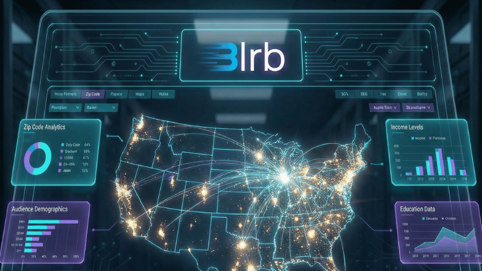
1. blrb.ai — Best for Audience Analytics and Demographics
Full disclosure: this is us. But we built blrb.ai specifically because the analytics gap in existing shorteners was too wide. Every other tool on this list tells you how many people clicked and roughly where they are. blrb.ai tells you which zip codes those clicks come from, then cross-references each zip code against U.S. Census data to surface median household income, education levels, homeownership rates, and employment data.
The Pro plan is $5/month. That includes 1,000 links, geographic click tracking down to the zip code, interactive link click heatmaps that dynamically adjust to your data density, full CSV export, QR codes, and ISP/organization identification. Bitly charges $300/month for their Premium tier and still only provides city-level data with no demographic insights.
Best for: Marketers, agencies, and businesses that need to know who’s clicking — not just how many. Political campaigns, real estate, home services, e-commerce brands targeting specific income brackets.
Pricing: Free (10 links/month, basic tracking) or Pro ($5/month for full analytics).
2. Rebrandly — Best for Custom Branded Domains
Rebrandly’s strength is branded short links. If your primary goal is replacing “bit.ly/abc123” with “yourbrand.co/promo,” Rebrandly makes that straightforward with a polished domain management interface. Their dashboard is clean, setup is fast, and they support multiple custom domains on paid plans.
Where Rebrandly falls short is analytics depth. Click tracking covers the basics — total clicks, top referrers, geographic breakdown by country and city. There’s no zip code-level data, no demographic enrichment, and no heatmap visualization. The free plan allows 10 links per month with one custom domain. Paid plans start at $13/month.
Best for: Brand-conscious teams who prioritize the appearance of their links over deep analytics.
Pricing: Free (10 links/month), Starter ($13/month), Pro ($32/month).
3. TinyURL — Best for No-Frills Quick Links
TinyURL has been around since 2002 and remains the simplest option. No signup required for basic shortening. Paste a URL, get a short link. The Pro plan adds custom aliases, link management, and basic analytics for $12.99/month.
Analytics are minimal even on paid plans — total clicks, referrer sources, and country-level geography. No city-level data, no demographics, no data export. TinyURL is a pure utility tool. If all you need is shorter URLs with a simple dashboard, it works. If you need analytics, look elsewhere.
Best for: Quick, one-off link shortening with zero setup required.
Pricing: Free (basic shortening), Pro ($12.99/month).
4. Short.io — Best for Developers and API-First Workflows
Short.io is built for technical teams. Their API is well-documented, rate limits are generous, and they support advanced features like link cloaking, deep linking for mobile apps, and A/B testing of destination URLs. Multiple custom domains are supported, and the dashboard includes UTM parameter management.
Analytics include click tracking by country, city, device, browser, and referrer. No zip code granularity or demographic data, but the API gives you raw click event data that you can pipe into your own analytics stack. If you’re building link shortening into an existing product or workflow, Short.io’s API is one of the best.
Best for: Developer teams integrating link shortening into custom applications or automated workflows.
Pricing: Free (1,000 links, 50,000 tracked clicks/month), Team ($49/month), Enterprise (custom).
5. Dub.co — Best for Open-Source and Transparency
Dub is the newer entrant positioning itself as the modern, open-source alternative. The interface is clean and fast, built with a modern tech stack. Features include custom domains, QR codes, link expiration, password protection, and analytics covering clicks, countries, cities, devices, and referrers.
Being open-source means you can self-host if you want full control, though most users will use the hosted version. Analytics are solid at the country and city level but don’t extend to zip code or demographic data. Pricing starts at $24/month for their Pro plan.
Best for: Teams that value transparency, modern interfaces, and the option to self-host.
Pricing: Free (25 links/month), Pro ($24/month), Business ($59/month).
6. BL.INK — Best for Enterprise Link Management
BL.INK targets enterprise teams managing thousands of links across departments. Features include team collaboration, permissions management, link tagging and organization, and integration with enterprise analytics platforms. Their compliance and security features make them popular in regulated industries like healthcare and finance.
Analytics cover the standard metrics — clicks, geography (country/city), devices, referrers — with the addition of enterprise reporting features and SSO integration. Pricing isn’t publicly listed for most plans, which is typical for enterprise-focused tools.
Best for: Large organizations needing team management, compliance features, and enterprise integrations.
Pricing: Expert plan starts at $99/month. Enterprise plans require contacting sales.
7. Bitly (Free/Growth) — When You Just Need the Basics
If you’re already on Bitly and your needs are genuinely limited to click counts and basic geography, the free or Growth ($35/month) plans might be sufficient. Bitly’s strength is brand recognition — recipients trust bit.ly links — and their interface is polished and familiar.
The limitation is clear: even at $35/month, analytics stop at city-level geography with no demographic data, no heatmaps, and limited historical data (4 months on Growth, 1 year on Premium). If you’re paying Bitly $300/month for Premium features, compare what you’re getting against blrb.ai Pro at $5/month — you might find you’re overpaying by $3,540/year for less analytical depth.
Best for: Teams that need a trusted, recognizable short domain and don’t require deep analytics.
Pricing: Free (10 links/month), Growth ($35/month), Premium ($300/month).
How These Bitly Alternatives Compare: Feature-by-Feature
| Feature | blrb.ai Pro | Bitly Growth | Rebrandly | Short.io | Dub.co |
|---|---|---|---|---|---|
| Monthly price | $5 | $35 | $13 | $49 | $24 |
| Links/month | 1,000 | 500 | 250 | 1,000 | 1,000 |
| Geographic detail | Zip code | City | City | City | City |
| Demographic data | Income, education, housing | — | — | — | — |
| Interactive heatmap | ✓ | — | — | — | — |
| QR codes included | ✓ | Extra $ | ✓ | ✓ | ✓ |
| CSV export | ✓ | Premium only | Paid plans | API | Paid plans |
| Historical data | Unlimited | 4 months | Varies | Unlimited | 1 year |
The Bottom Line
Every shortener on this list handles the basics well. The choice depends on what you need beyond basic shortening. If branded domains are your priority, look at Rebrandly. If you need API depth, Short.io is strong. If you want enterprise team management, BL.INK is built for that.
But if the reason you’re looking for a Bitly alternative is that you want to know more about who is clicking your links — their neighborhoods, their income levels, their demographics — there’s only one option that provides that data, and it costs a fraction of what Bitly charges for less.
Ready to see who’s really clicking? Start free with blrb.ai — upgrade to Pro for $5/month for zip code demographics, interactive heatmaps, and full data export.